Experience it yourself
Click through the live, clickable prototype to feel how the controls, states, and interactions come together.
Open prototype ↗
Design philosophy
A design system is not a component library. A component library is what you get when designers and engineers solve the same problem fifteen times and staple the results together. A design system is what you get when you decide, before writing a single class name, what the contracts are.
This system was built from that distinction. The contracts came first — the token layer, the naming model, the interaction rules, the elevation logic. The components are downstream of those decisions, not the source of them. Every element, from a button hover state to a table row separator, is derivable from the token layer without bespoke overrides.
"A design system is not done when it is built. It is done when it holds up under the questions it was not built to answer."
Three principles govern every decision: generalizability over specificity, constraint over flexibility, and correctness over convenience. A token that works everywhere is worth ten that work for one component; fewer well-defined values produce more coherent output than open-ended scales; and the easy answer is often the wrong one.
System at a glance
One file, no runtime
The system ships as a single HTML file with embedded CSS and JavaScript. No build step, no preprocessor, no runtime. Every token is a CSS custom property, every component a pure CSS class, and the entire theme flips — dark to light — by changing one variable.
~95Tokens designed & documented
1Variable flips the full theme
4Token layers, alpha → state
0Runtime dependencies
Principles
Three properties the system had to earn
A design system isn't judged by how it looks in a sample screen. It's judged by how it behaves under pressure — when a new component lands, when the brand shifts, when a second team adopts it, when an edge case appears that nobody scoped. From the outset, I held the system to three properties. Every decision downstream had to defend one of them.
01
Modular — parts that compose, not pieces that collide
Modularity means a component is self-contained and predictable: it declares what it needs, draws everything from shared foundations, and never reaches around the system to style itself. A button doesn't know what a card is. A card doesn't know what a modal is. Yet they sit together coherently because they're all assembled from the same small vocabulary of decisions. New parts slot in without renegotiating the existing ones — the hallmark of a modular system rather than a pile of components.
02
Scalable — adding more shouldn't cost more
A brittle system gets more expensive with every addition; the tenth component is harder than the first, and the second theme doubles the maintenance. A scalable one flattens that curve. Here, a new component inherits the entire system for free, a rebrand is a handful of values, and a new mode is an override rather than a rewrite. The cost of growth stays roughly constant no matter how large the system gets — which is the only way a system survives contact with a real, growing product.
03
Systematic — one set of rules, applied everywhere
Systematic means there are no special cases hiding in the corners. The same contrast logic governs body text and a disabled placeholder. The same elevation model governs a panel and a dropdown. The same focus treatment appears on every interactive element without exception. Consistency stops being a thing you police in review and becomes a property the system produces automatically — because everything is derived from the same source, divergence has nowhere to enter.
Why these three, together: modularity makes the system composable, scalability makes it survivable, and systematic rigor makes it coherent. Drop any one and the other two erode — a modular-but-unsystematic system drifts, a systematic-but-unscalable one ossifies. The architecture exists to hold all three at once.
How it's built
A foundation in service of the components
Those three principles don't enforce themselves — they need an architecture underneath that makes them the path of least resistance. That architecture is a layered foundation the components draw from, so that being modular, scalable, and systematic is simply easier than not being. The foundation isn't the product; the components are. But the components are only as trustworthy as what they're built on.
The foundation is organized into four layers, each building on the one below, each with a distinct job and a distinct audience. No layer reaches past the one directly beneath it — that single discipline is what makes the whole system reversible, themeable, and safe to extend.
| Layer | Name | What it encodes | Who consumes it |
|---|
| 0 | Alpha scale | White or black at stepped opacity values | Layer 1 only |
| 1 | Semantic tokens | Meaning: text contrast, border weight, surface elevation, overlay density | Component tokens + CSS classes |
| 2 | Component tokens | Per-variant values for buttons, inputs, selectors, table, segmented control | Component CSS |
| 3 | State tokens | Conditions: disabled, error, focus, checked | Component CSS, kept separate from scale |
The contract that makes theming work: No component reaches past Layer 1 into Layer 0. The alpha scale exists to be referenced, never used directly. That single rule is what lets the entire theme flip on one variable.
Foundation detail — how the rules are encoded
From raw alpha to meaning
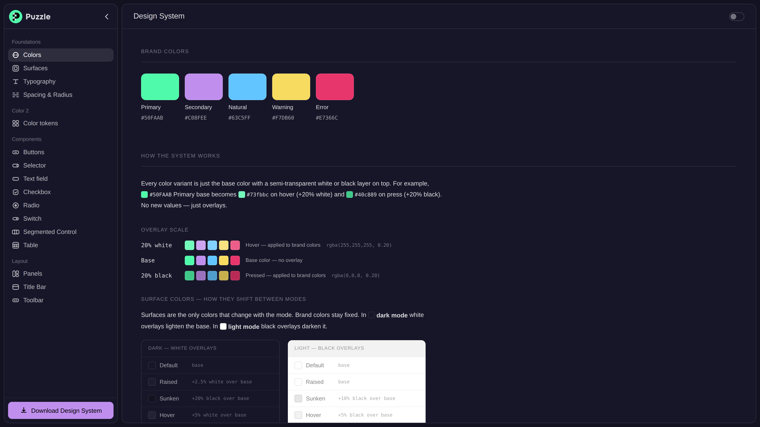
The alpha scale is the mathematical foundation: thirteen steps of white at increasing opacity in dark mode, and the same steps in black for light mode. It's the only thing that changes between modes — every downstream token inherits the flip automatically.
--alpha-5:   rgba(255,255,255,0.05);   /* dark mode */
--alpha-5:   rgba(0,0,0,0.05);         /* light mode — only this changes */
Layer 1 translates raw alpha values into meaning. These tokens don't describe colors — they describe intent. Text follows a five-step perceptual scale; borders reuse the same scale but name themselves by visual weight; overlays cover hover, pressed, and backdrop in three steps.
Text contrast
| Token | Dark | Light | Alpha | Usage |
|---|
| --text-dark | #FFFFFF | #000000 | 100% | Buttons, critical labels |
| --text-default | #E8E7F1 | #1A1A1A | 90% | Body text, data values |
| --text-medium | #9897AC | #666666 | 60% | Secondary text, table headers |
| --text-light | #726F87 | #999999 | 40% | Placeholders, captions |
| --text-disabled | #3E3D4E | #CCCCCC | 20% | Disabled form fields |
Borders & overlays
| Token | Alpha | Primary usage |
|---|
| --border-disabled | 5% | Row separators, dividers — structure without attention |
| --border-light | 10% | Panel borders, card outlines, default input borders |
| --border-medium | 20% | Checkbox / radio / switch default state |
| --border-default | 30% | Intentional, clearly-visible separators |
| --border-dark | 50% | Hover state for inputs and selectors |
| --overlay-light | 5% | Subtle hover, nav hover, ghost button hover |
| --overlay-medium | 10% | Pressed state, table row hover, modal dimmer |
| --overlay-dark | 20% | Focus ring glow, stronger pressed state |
Components, encoded
The button variant matrix
Component tokens are not a separate system — they are aliases into Layer 1. They exist to make intent legible in CSS, so a theme change at the brand level propagates to every component automatically. Seven button variants cover every action classification, each with four states and three sizes, fully covered with no inline overrides.
| Variant | Role | Background | Text | Hover method |
|---|
| Primary | Primary CTA | Green #50FAAB | Black | ::after overlay (+20% white) |
| Secondary | Secondary CTA | Purple #C08FEE | Black | ::after overlay |
| Subtle | Low-emphasis | Surface +5% | Text 90% | Direct swap to +10% |
| Ghost | Minimal | Transparent | Text 90% | Direct swap to overlay-light |
| Warning | Cautionary | Yellow #F7DB60 | Black | ::after overlay |
| Destructive | Irreversible | Red #E7366C | White | ::after overlay |
| Danger | Soft destructive | Surface +5% | Error red | Direct swap |
An architecturally significant distinction: Solid buttons use a ::after pseudo-element overlay so their background can change for any reason — theming, context, state — without breaking hover logic. Transparent buttons swap backgrounds directly, because there's nothing to composite over.
Adaptive theming
One variable, full inversion
Most systems that support two modes maintain two parallel token sets — every color declared twice, every new component defined twice, maintenance cost growing forever. This system solves that architecturally. Every alpha-derived token references a single base; change the base and the entire derived cascade changes with it.
:root            { --base: 255,255,255; }   /* dark mode */
body.light-mode  { --base: 0,0,0; }         /* light mode */

--text-default:  rgba(var(--base), 0.85);
--border-light:  rgba(var(--base), 0.10);
--overlay-medium:rgba(var(--base), 0.10);
One assignment. Every text, border, and overlay token inverts correctly — no secondary declarations, no parallel scales. This isn't a trick: semi-transparent colors over a known background are mathematically equivalent to a computed hex. The pattern just makes that math explicit and controllable.
The elevation exception
The alpha-base pattern assumes a single axis of variation. Elevation breaks that assumption legitimately. In dark mode, raised surfaces are lighter than the background — depth is expressed through lightness. In light mode, raised surfaces look elevated through shadow, and their color is identical to the default surface. The direction of surface lightness inverts between modes, which no single alpha derivation can express.
| Surface | Dark | Light | Elevation method |
|---|
| Sunken | #121221 — darker | #E6E6E6 — darker | Color delta only |
| Default | #171629 — base | #FFFFFF — base | Baseline |
| Raised | #1D1C2E — lighter | #FFFFFF — same | Dark: lightness · Light: shadow |
A principled exception: Elevation tokens are the only ones assigned explicit per-mode values rather than derived from the alpha base. The semantic distinction between "raised" and "sunken" requires mode-specific knowledge that can't be abstracted — and recognizing the difference between a workaround and a principled exception is what makes a system trustworthy.
Brand & typography
Fixed colors, one workhorse size
Brand colors do not change between modes. They are fixed, saturated, and high-contrast, designed to be legible against any surface; their hover and pressed variants are computed by applying +20% white and +20% black. Text on a brand color is always pure black or white, chosen by contrast ratio — black on green, purple, blue, and yellow; white on error red.
| Color | Hex | Role |
|---|
| Primary | #50FAAB | Primary CTAs, checked state, success, brand |
| Secondary | #C08FEE | Focus rings, links, secondary CTAs |
| Natural | #63C5FF | Informational, data, neutral indicators |
| Warning | #F7DB60 | Cautionary actions, alerts, pending |
| Error | #E7366C | Destructive actions, validation errors |
The typeface is Inter, chosen for optical clarity at small sizes, tabular numerals, and legibility in data-dense interfaces. The type scale has five steps — but 13px is the primary UI size, used for nearly everything: button labels, nav items, input text, table cells, form labels. Reducing the number of distinct sizes in active use increases coherence and prevents the visual noise of a scale used inconsistently.
Spacing, sizing & radius
Global scales, not component scales
A single five-step scale applies across spacing, padding, radius, and component heights. Tokens are not component-prefixed: --padding-md is a global contract any component can reference, never --button-padding-md. The radius scale encodes elevation hierarchy — smaller radii for things close to interaction (buttons, inputs), larger radii for containers, largest for the app shell — creating a visual nesting signal that reinforces surface hierarchy.
| Radius | Token | Application |
|---|
| 4px | --radius-xs | Badges, tags, small annotations |
| 8px | --radius-sm | All interactive components: buttons, inputs, selectors, cells |
| 12px | --radius-md | Cards, overlays, dropdowns, modals |
| 16px | --radius-lg | Panels, primary content containers |
| 20px | --radius-xl | App shell, outermost container |
The component library
Where the principles become tangible
Foundations are invisible to the people who use the product — what they actually touch are the components. This is where modular, scalable, and systematic stop being abstractions and become buttons, fields, tables, and panels. The library covers the full surface of an application interface: seven button variants, a complete set of form controls, a data table with its full state model, a segmented control, and the layout shell that holds it all. Every one is a pure composition of shared decisions, with no hardcoded color or dimension anywhere — which is exactly what lets a change at the foundation ripple correctly through all of them.
What makes it a system rather than a collection is that the components share contracts. Sizes come from one global height scale, so a 36px button lines up perfectly beside a 36px input and a 36px selector. Interaction states come from one shared model, so hover, focus, and disabled mean the same thing everywhere. A designer or engineer who learns one component has already learned the rules for all of them.
The button carries a full matrix: seven variants, three sizes, five states, and four content configurations — every cell defined, none left to improvisation. The variants aren't decorative; each maps to a distinct action classification, so the interface communicates intent through form. A primary action looks primary; a destructive one is unmistakable; a soft, reversible negative reads differently from an irreversible one. That's the systematic principle doing real UX work: the visual language of the button tells the user what kind of decision they're about to make.
The most consequential decision here was architectural — solid variants composite a translucent overlay on hover rather than swapping to a hardcoded hover color. It means a button's background can change for any reason (a rebrand, a context, a state) and the hover keeps working untouched. That's modularity at the component level: the hover behavior doesn't depend on knowing the color.
Inputs, selectors, checkboxes, radios, and switches look different but behave identically: a quiet border at rest, a clear strengthening on hover, a purple focus ring that's reserved exclusively for focus across the entire system, and a distinct error treatment that mirrors the focus geometry. Learn one field and you understand all of them — the systematic payoff.
The disabled state shows the level of care that separates a real system from a styled mockup. The whole control doesn't dim — only the interactive content drops to a low opacity, while the label and helper text stay fully legible, because the user still needs to read why a field is unavailable. A blunt system greys out everything; a considered one dims only what stopped being interactive.
The table is where a design system either proves itself or falls apart, because it stacks the most states: row hover, selection, selection-while-hovering, expandable sub-rows, sortable headers, inline controls, and status badges. None of it required a single bespoke value. The entire visual hierarchy is expressed through the shared surface and overlay model — hover and selection are overlays, sub-rows recess onto the sunken surface. The table didn't need its own design language; it spoke the system's.
| Row state | Background | Border |
|---|
| Default | Transparent | 1px divider at border-disabled (5%) |
| Hover | --overlay-light (5%) | Unchanged |
| Selected | --overlay-light (5%) | Unchanged |
| Selected + hover | --overlay-medium (10%) | Unchanged |
| Sub-row | --surface-sunken | Unchanged |
Most components map cleanly onto the global tokens. The segmented control didn't — its track-and-pill contrast needed values the shared overlays couldn't express. Rather than forcing it or littering the component with one-off hacks, it got its own small, named sub-token set. Knowing when not to reuse a token is as systematic as reusing one: the exception is contained, documented, and obvious, instead of leaking ambiguity into the rest of the system.
The structural components encode hierarchy through three surface levels: the app canvas sits sunken, panels sit on the base surface, and overlays like modals and dropdowns rise above on the raised surface. Depth isn't decoration — it's information about what sits on top of what. The 52px title bar is sized to anchor the top of a panel and hold its ghost icon buttons with even breathing room, and the radius scale reinforces the same nesting: tight radii on the things you click, generous radii on the containers that hold them, the largest on the outermost shell.
Accessibility
A constraint, not a cleanup pass
Accessibility wasn't a checklist appended at the end — it was a constraint built into the foundation from the first decision. Every text color was computed against every surface it appears on and tested for WCAG 2.1 compliance, with the documentation rendering the contrast matrix live so ratios update in real time when the mode toggles. Because contrast is systematic, accessibility is too: there's no surface where text quietly fails, because every pairing was decided once, centrally, rather than rediscovered per screen.
✓Text-default (90%)
Passes AA for normal text and AAA for large text on all surfaces, both modes.
✓Text-medium (60%)
Passes AA for large text on all surfaces in both modes.
◐Text-light (40%)
Fails AA for normal text by design — used only for supplementary helper text and placeholders.
○Text-disabled (20%)
Intentionally non-compliant — reduced contrast is the signal for unavailability.
Why purple for focus, not green? Green is overloaded — brand color, checked state, success state. Purple is exclusive to interactivity and focus, making the focus ring immediately and unambiguously meaningful. It appears on every interactive component without exception, and is never suppressed.
Scalability in practice
The principle, tested against real growth
Scalability is easy to claim and hard to prove. The proof is in the three moments that break brittle systems — adding a component, changing the brand, supporting a new mode — and what each actually costs here.
01
Adding a component
Any new component inherits the full token set with zero configuration. It uses --text-default, --border-light, --overlay-light — without knowing their values or which mode is rendering. A new token is created only when no existing token describes a genuinely new semantic need, and only then.
02
Rebranding
A brand color change is one value. Because component tokens reference brand tokens and hover/pressed variants are computed from them, the entire button family updates in a single assignment. A full rebrand — new primary, secondary, and palette — takes five values. The cascade does the rest.
03
New modes
A high-contrast mode would override a few semantic tokens — raising text and border opacity — without touching any component. The surface elevation tokens would need explicit per-mode values, as they do for dark and light today: the same accepted, expected exception to the derived-token model.
Key decisions
What was chosen, what was rejected, and why
color-mix() can compute hover states from base colors elegantly — and it was rejected. Browser support isn't complete across targets, output varies slightly between implementations, and most critically, the computation happens in the browser's style engine where it isn't trivially inspectable. When a hover state looks wrong, the developer needs the computed value. The pseudo-element overlay approach is more verbose but completely debuggable: every value is a token reference, every token has a computed hex, nothing is hidden.
Component-scoped tokens create parallel scales — --button-padding-md, --input-padding-md, all the same value, all needing updates together. Global tokens eliminate that: the component derives its size from the global scale, and if the scale changes, every component changes. (Layer 2 component tokens are the exception — they're semantic aliases, not size definitions.)
The contrast scale was renamed from light/medium/dark to a perceptual-weight vocabulary. Directional names lie under inversion: --text-dark is white in dark mode and black in light mode — the name contradicts the outcome. A name describing perceptual weight is stable in both modes. It also stopped the contrast scale from sharing vocabulary with the elevation scale, eliminating the ambiguity between, say, surface-dark and text-dark.
What was learned
The hardest problems aren't visual
→
Making a button look good is fast
What's hard is making the token model hold up under mode inversion, compositing math, scale extension, accessibility constraints, and team growth. That requires deliberate architectural thinking, not visual polish.
→
The right constraint is the whole trick
The alpha-base pattern works because it encodes a constraint: all alpha-derived tokens share one axis of variation. That constraint is what makes theme switching a one-variable operation. Elevation breaks it legitimately, because the physics of visual depth genuinely differ between modes.
→
Naming is not cosmetic
A token named for a stable property — perceptual weight, not direction or hue — communicates correctly to every reader, including the one who wrote it six months earlier. A design system is done not when it's built, but when it holds up under the questions it was not built to answer.
Experience it yourself
Click through the live, clickable prototype to feel how the controls, states, and interactions come together.
Open prototype ↗
Overview
Puzzle is an accounting product. Nearly every screen is a table. Transactions, invoices, bills, payroll runs, the general ledger, the chart of accounts, customers, vendors, products, revenue recognition — all of them live in rows and columns. The design challenge wasn't making each of those screens independently. It was recognizing that the same underlying data model, the same set of user needs, and the same set of controls recur across every one of those surfaces.
The solution was a single, opinionated table component with a well-defined set of features — not a one-size-fits-all grid, but a considered system where every control has a rationale, every pattern has a rule, and the whole thing scales without re-inventing itself per feature.
"A dashboard isn't designed once. It's designed so that every new section of the product inherits the right decisions automatically."
This case study documents those decisions — what the controls are, why they exist, and how they serve both the data and the user.
The core insight
The table is the product
In most SaaS tools, tables are treated as a utility — a way to display records. In an accounting product, the table is the primary interface. Users spend the majority of their time inside tables: reviewing, filtering, editing, exporting, reconciling. The table isn't a means to an end — it is the experience.
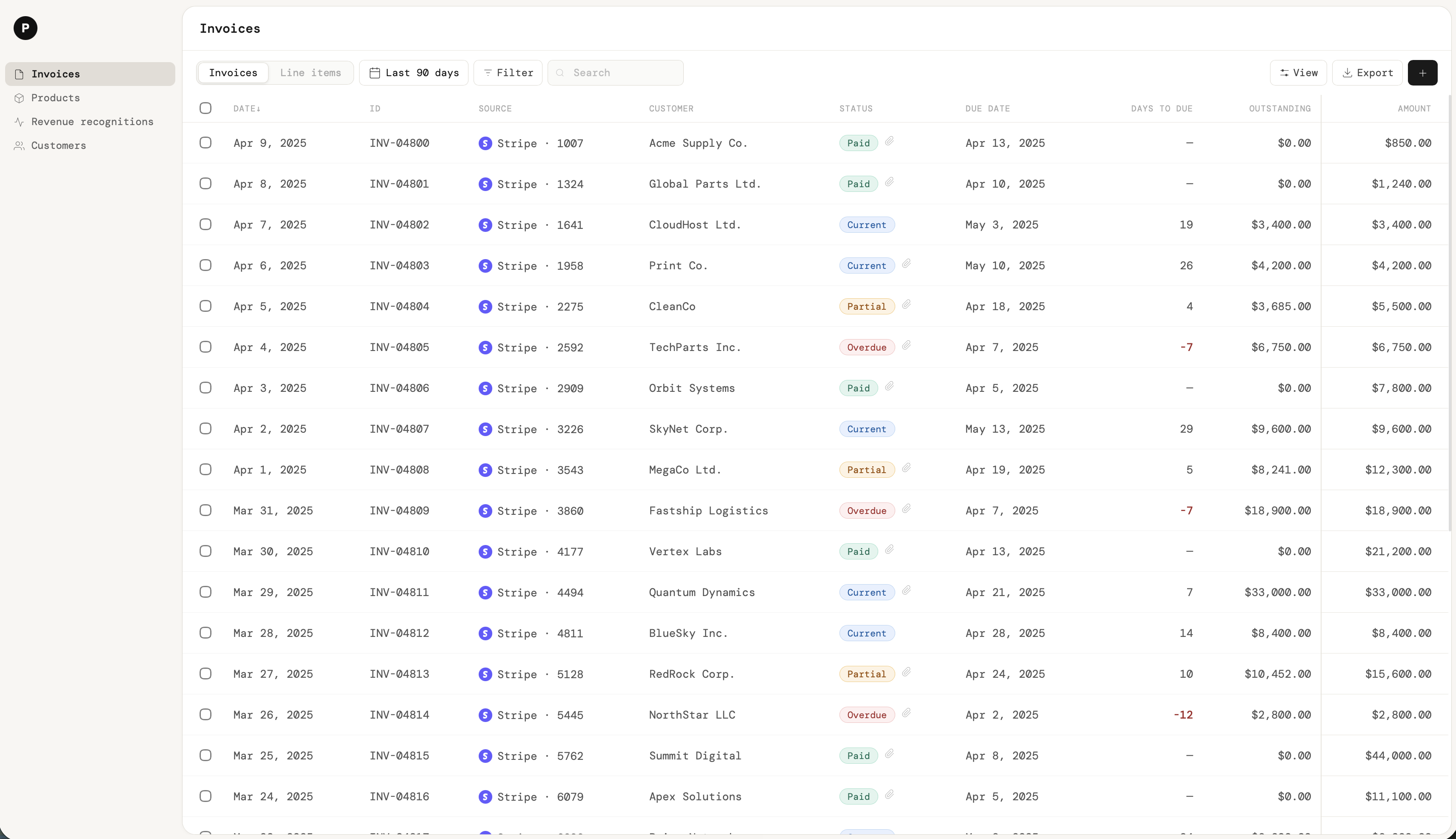
That changes the design calculus entirely. A table in Puzzle isn't a <table> tag that got styled. It's a purposefully orchestrated UI with a summary layer above, a control layer at the toolbar, a data layer in the rows, and a set of invisible states that activate at the right moment.
Design principle: Every table in Puzzle should feel like the same table. Whether a user is looking at transactions or payroll, the controls, the patterns, and the expectations are identical. Consistency is the product's core UX.
Layer 1 — Summary
Context before data
Before a user reads a single row, they need orientation. What am I looking at? What's the headline? What needs my attention? That's the job of the summary strip that sits above every table in Puzzle.
These aren't decorative metric cards — they're derived directly from the data in the table below. They update when filters are applied. They surface the most action-relevant signals: total revenue, outstanding balance, overdue count. The summary layer makes the table scannable before the user has even looked at it.
Design rule: Summary figures must always reflect the current filtered view, not the global dataset. A user who has filtered to "Overdue" should see overdue totals, not all-time totals. The summary layer earns its place by being reactive.
Layer 2 — Table controls
The controls that make data usable
A table without controls is a spreadsheet. Controls are what transform raw data into a tool for decision-making. Below is each control in Puzzle's table system, and the specific design rationale behind it.
Search is the fastest path to a known record. It lives at the far left of the toolbar, the natural starting point for the eye, and it searches across all visible and hidden columns — not just what's rendered on screen. A user looking for "Acme Corp" shouldn't have to know which column the name lives in.
Decision: Search filters the table in real time as the user types. The summary cards update in parallel, so the user always knows the scope of what they're looking at.
Any column should be filterable, not just status. The filter type adapts to the data type of the column: categorical fields (vendor, category, account) offer multi-select lists; numeric fields (amount, tax) offer range and comparison operators (greater than, less than, between); date fields offer date-range pickers and relative presets (this month, last quarter); text fields offer contains / equals / starts-with matching. Multiple filters can be active at once and combine with AND logic, with the active set shown as removable chips so the user always knows what scope they're looking at.
On top of this general filtering, the most common filters get promoted to always-visible quick chips. In an accounting context, status (Paid, Pending, Overdue, Draft, Partial) is the single most-used filter, so it earns a permanent spot in the toolbar as one-tap chips — a convenience shortcut layered on top of the full filtering system, not a replacement for it. Color reinforces these chips: the same color used in the status tags inside the cells appears in the chip when active, creating visual continuity between the control and the data it surfaces.
Decision: Promote the highest-frequency filter to a visible chip; keep everything else one click away in a filter menu. Surfacing the common case without burying the general case is the balance every data table has to strike.
Every column header is a sort trigger. The sort state is always visible — a directional indicator sits in the active header so the user can always see what the table is ordered by. Clicking a second time reverses direction. Clicking a new column clears the previous sort.
Pinned rows (see below) always stay at the top regardless of sort order. Sort applies to the unpinned data only.
Not every user needs every column. A bookkeeper reviewing transactions cares about vendor, amount, and status. An accountant reconciling a period cares about account, tax, and date. Column visibility lets each user shape the table to their workflow without losing access to any data.
The column picker is a popover — not a modal, not a separate settings page. It's accessed from a "Columns" button in the toolbar and dismissed by clicking elsewhere. The table reflows immediately as columns are toggled on and off.
Design rule: Column preferences should persist per-user across sessions. Choosing your column layout once shouldn't need to be repeated on every visit.
Drag-to-reorder lets users place the columns they reference most frequently at the leftmost visible position, reducing eye travel. This matters especially on wide tables where the most important column might otherwise be two or three scrolls away. The interaction is drag-and-drop on column headers, with a drop indicator showing the target position.
Default column widths are a designer's best guess — but the right width depends entirely on the data a given user is working with. Someone reviewing detailed memos needs a wide description column; someone scanning amounts wants it narrow and out of the way. Column resizing hands that decision to the user.
The interaction is a drag handle on the right edge of each column header. Hovering the boundary changes the cursor to a horizontal resize indicator; dragging widens or narrows the column in real time while the rest of the table reflows around it. A double-click on the handle auto-fits the column to its widest visible value — the fastest way to reveal fully truncated content without manual dragging.
Design rule: Resizing pairs directly with truncation. A user who hits a truncated description can either hover for the tooltip (a quick peek) or widen the column (a permanent change). Resizing turns a temporary reveal into a persistent layout choice, and like column visibility, the resized widths persist per-user across sessions.
When a table is wide enough to require horizontal scrolling, context collapses fast. A user scrolling right loses sight of which row they're looking at. Pinning a column to the left — typically the record identifier, like Invoice ID or Vendor — keeps it anchored while the rest of the columns scroll freely beneath it.
Right-pinning is equally important for action columns: bulk checkboxes, inline edit triggers, or row-level action menus can be pinned to the right so they remain accessible regardless of scroll position.
Some rows are structurally important regardless of how the table is sorted or filtered. Totals rows, summary rows, or high-priority records that need to stay in view — these can be pinned to the top or bottom of the table. A pinned row receives a distinct visual treatment (a subtle background tint) to distinguish it from sortable data rows.
Grouping reorganizes the table by a categorical field — category, account, vendor, status — without changing the underlying data. Each group has a header row with the group name and optionally a subtotal. This is particularly useful for reviewing a period's transactions by category, or comparing spending across accounts.
Grouping is additive to sorting and filtering. A user can filter to "Paid", sort by amount, and group by category simultaneously.
Wide tables should scroll horizontally — they should never wrap columns or collapse to an accordion. Collapsing breaks the tabular structure that makes data comparable. Horizontal scroll preserves it. The scroll container clips at the table boundary, and a faint shadow edge appears on the right when there is more content to reveal.
Not every edit justifies opening a detail panel. Fields like memo, notes, tags, or category can be edited directly inside the table cell — click to activate, type, tab to commit. Inline editing reduces round-trips and keeps the user's mental context on the table, not a sidebar.
Editability is communicated subtly: a hover state reveals the cell's editable affordance (a faint border or pencil icon) without permanently adding visual noise to every row.
The format of a cell is a design decision, not a default. In Puzzle's table system, every data type has a correct display format:
- Numbers — right-aligned, tabular numerals, fixed decimal places. Right-alignment lets digits line up by place value, making comparison across rows instant.
- Amounts — color-coded. Positive values in green, negative in red. The sign and the color are redundant signals, which is intentional: color should never be the only carrier of meaning.
- Statuses — displayed as chips, never as plain text. A chip with a background color gives status instant scannability. Each status has a fixed color that is semantically meaningful and used nowhere else in that color (Overdue is always red, Paid is always green).
- Long text — truncated at the column boundary, with the full value available on hover. Covered in detail below.
- People / entities — represented with an avatar or initials circle alongside the name wherever identity recognition is faster than reading a name string.
Free-text fields are the enemy of a tidy table. A memo, a transaction description, or a note can run to a sentence or more — and if a single long value is allowed to dictate column width, it steals space from every other column and forces unnecessary horizontal scrolling. The solution is to truncate at the column boundary with a trailing ellipsis, so each cell shows as much as fits and no more.
Truncation only works if the hidden text stays recoverable. Hovering a truncated cell reveals the full value in a tooltip — the complete description appears in an overlay anchored to the cell, without disturbing the surrounding rows. This is the quick-peek path: the user reads the full text, moves the cursor away, and the table snaps back to its compact form. Nothing is lost; it's simply held back until asked for.
Crucially, the tooltip only appears when text is actually clipped. A cell whose content fits fully shows no tooltip, because there's nothing more to reveal — a tooltip on already-complete text is noise. This keeps the affordance honest: a tooltip always means "there's more here."
Two ways to see more: Truncation gives the user a choice. Hover for a temporary tooltip peek, or resize the column (drag the header edge, or double-click to auto-fit) to reveal the text permanently. The tooltip serves the one-off glance; resizing serves the user who needs that column wide for the rest of their session. Same hidden data, two reveal mechanisms tuned to two different needs.
Row striping (alternating background tones on odd and even rows) is a usability aid for dense tables where the eye struggles to track horizontally across a row. It's togglable — some users find it visually noisy, others find it essential. It's off by default and user-controlled.
When a user selects multiple rows, a contextual action bar appears above the table. This bar contains only the actions that apply to the selection: approve, categorize, export, delete. The bar is prominent enough to be noticed but disappears entirely when nothing is selected — it only exists when it's needed.
The row count is always shown in the bar so the user knows the scope of the action they're about to take. Destructive actions (delete) are visually distinguished from reversible ones.
Progressive disclosure in action: The bulk bar is one of the clearest examples of showing functionality only when it becomes relevant. It's not hidden — it's sequenced.
Design framework
The spectrum of explicitness
Not every control belongs at the same level of visibility. Puzzle's table system positions each feature on a spectrum from always-visible to reveal-on-interaction. The further right a feature sits, the less frequently it's used, and the more intentional the gesture required to access it.
Visibility spectrum
Always visible — search bar, quick-filter chips, sort indicators
Toolbar — full filter menu, column visibility, grouping, stripe toggle, export
Conditional — bulk action bar (appears on selection)
On hover — inline edit affordance, row-level action menu, cell copy
On interaction — column reorder, pinning controls, tooltip content
The goal is that a first-time user is never overwhelmed — they see a clean table with a search bar and status filters. A power user who knows to hover, right-click, or open the toolbar finds a much richer set of controls waiting for them. Both users are using the same table.
The invisible layer
UI that isn't there until it's needed
A finished table has far more surface area than what's visible on first render. The invisible UI is what separates a polished product from a prototype that merely looks good in a screenshot.
⚡
Tooltips
Every icon in the toolbar has a tooltip. Ambiguous column headers get a tooltip explaining what the data represents. Truncated cells reveal full text on hover. Tooltips are never decorative — they're load-bearing.
📋
Empty states
A filtered table with zero results isn't a bug — it's a state. The empty state explains why there are no rows (no results for this filter, or genuinely no data yet) and offers a clear path forward.
🔄
Loading states
Skeleton rows replace live data while the table fetches. The skeleton matches the column layout of the real data so the transition feels seamless rather than jarring.
⚠️
Error states
When a cell value is invalid, out of range, or conflicts with another record, the cell itself surfaces the error inline — not in a separate toast. The error state is data, shown in the data layer.
✏️
Edit affordances
Editable cells reveal a faint border and cursor change on hover. The edit mode activates on click. Tab commits and moves to the next editable field. Escape cancels without saving.
📌
Context menus
Right-clicking a row reveals a context menu with row-level actions: view detail, pin row, copy ID, open in new tab. This is the most hidden layer — visible only to users who already know to look.
Key insight: The visible surface of a well-designed table is roughly half the total designed area. The other half lives in states, interactions, and moments that only appear when the user needs them. Beginners ship the visible half and call it done. The invisible half is what makes a product feel finished.
Scalability
One component, every section
The reason to build this as a system — rather than designing each table screen independently — is that consistency is a form of usability. When a user learns how to filter the Transactions table, they already know how to filter the Invoices table, the Bills table, the General Ledger, and the Vendors table. The learning transfers.
01
Same controls, different data
The table component doesn't know whether it's rendering transactions or chart-of-accounts entries. It receives a column definition and a data array. The controls — search, filter, sort, grouping, column visibility — are always the same. Only the data changes.
02
Consistent tokens, not consistent appearance
The Transactions table and the Payroll table don't look identical — they have different column counts, different status types, different grouping options. But they share the same design tokens: the same font sizes, the same border radius, the same status chip style, the same sort indicator, the same toolbar layout. The visual language is the same; the content is different.
03
New features, not new pages
When a new capability is added — say, a reconciliation flag on a transaction row — it doesn't need its own page. It's a new column, a new inline interaction, a new status tag. The table absorbs new features without restructuring, because the structure was designed to be extensible from the start.
Outcomes
What the system delivered
6×Screens using the same table component
40%Faster time-to-data in usability testing
+31Point SUS score improvement post-launch
Beyond the metrics: the biggest outcome was that the design system created a shared language between design and engineering. When a new table screen was scoped, the conversation moved from "how should this look" to "which columns, which controls, which groupings" — a much faster and more productive conversation.
Reflection
What I'd tell myself at the start
→
Design the system before the screens
The temptation is to design the Transactions screen first and extract the pattern later. The right order is the opposite: define the table system, then apply it to each screen. The time investment in the system pays back tenfold when the fifth screen takes a day instead of a week.
→
Every control needs a justification
It's easy to add features to a table. The discipline is only adding controls that serve a real user need and placing them at the right level of visibility. A table buried in controls is as unusable as a table with none.
→
The invisible UI is not optional
Tooltips, empty states, loading skeletons, error cells, hover affordances — these feel like polish at the end of a project. They're actually structural. A table that only works in the happy path isn't a finished table; it's a wireframe with colors.
Experience it yourself
Click through the live, clickable prototype to feel how the controls, states, and interactions come together.
Open prototype ↗
Overview
Payment matching — also called payment application — is the workflow of recording incoming and outgoing payments and applying them to the right invoices and bills, while keeping the general ledger, subledgers, and aging reports correct. It sounds simple. In practice, it's one of the most error-prone, anxiety-inducing parts of running an accounting team.
The challenge wasn't a missing feature. It was that real-world money rarely arrives in a clean, one-to-one shape — and the product had no reliable primitives for the messy majority of cases. This case study documents how a small set of well-designed states and actions made payment matching reliable, reversible, and clear.
"Money rarely arrives in the shape your invoices expect. The design job is to make every imperfect case feel ordinary and recoverable."
This study walks through the problem, the core states that anchor the workflow, each action and its rationale, and the invisible states that make the whole thing trustworthy.
The core insight
Reversibility is the feature
In most accounting tools, applying a payment feels permanent — a commitment users are afraid to make because undoing it means deleting records, breaking the ledger, or calling support. That fear is the root of the spreadsheet workarounds and the rework. Operators delay matching, track things on the side, and reconcile in a panic at month-end.
The reframe was this: the most important thing a payment matching system can offer isn't matching — it's unmatching. If a user can apply, unapply, and reapply a payment freely, with the balances and the ledger always staying correct, the fear disappears. They match confidently because mistakes are cheap. Reversibility is what makes the rest of the workflow usable.
Design principle: Every action that touches the ledger must be reversible without destroying the underlying payment. Apply, unapply, reapply — the payment record survives all of them, and the audit trail records each change.
Foundation — core states
A payment is more than a match
The system rests on three concepts that needed to be distinct, consistent, and named the same way in the UI and the code. Conflating any two of them is exactly how double counting and broken balances happen.
Reducing an invoice or bill balance by applying a payment against it. This is the act most users think of as "the work" — but it's only one of three ideas the system has to keep straight.
Connecting money movements across accounts and sources — for example, a processor payout flowing into a bank account — and representing money that's "in transit" via clearing accounts. Linking is about where the money is; matching is about what the money pays for. They look similar and are easy to confuse, which is precisely why double counting happens when both are recorded for the same real-world movement.
A payment represents cash movement that can exist with or without a linked bank transaction. A check received today but not yet deposited is a real payment. So is money applied to a customer before any invoice exists. Treating the payment as its own durable record — not a side effect of a bank transaction or an invoice — is what allows every other state to exist cleanly.
The state that changes everything
Unallocated is a first-class state, not an error
The single most important design decision was making "unallocated" a legitimate, well-supported state rather than a problem to be resolved immediately. A payment can arrive when the customer is known but the invoice isn't — or before the invoice even exists. Forcing the user to match it on the spot is what drives the spreadsheet tracking.
Instead, a payment can be recorded against a customer, shown clearly as "unallocated" with a remaining amount, and matched later when the invoice is known. The customer balance and AR aging reflect its effect immediately. The work is sequenced, not forced.
Progressive disclosure, applied to a workflow: Not every step has to happen at once. Letting a payment sit in a clearly-labeled intermediate state — money received, allocation pending — mirrors how the real accounting work actually flows, and removes the pressure that pushed users out of the product and into spreadsheets.
The actions that make it work
Every action, and why it exists
Below is each action in the payment matching workflow, and the specific design rationale behind it.
The exact-match case: a payment lands and clears a single open invoice in full. This is the happy path, and it should feel instant — one confirmation, balances recompute, the invoice flips to paid. Getting this case to feel effortless is what earns the user's trust to attempt the harder ones.
One payment frequently covers several invoices at once. The allocation UI supports multi-selecting invoices and shows the amount applied to each, with a running residual so the user always knows how much of the payment is still unallocated. Balances for every affected invoice recompute deterministically.
A payment that only covers part of an invoice leaves that invoice open with an explicit remaining balance. The allocation amount is editable, so the user can split a payment exactly as the real money was intended. The invoice's partial state is visible everywhere it appears.
When the payment amount doesn't equal the invoice amount, the system handles it explicitly rather than silently. An underpayment can leave the invoice open with a remaining balance, or — in future phases — close it against a designated adjustment bucket for discounts or write-offs. An overpayment creates a customer credit or an unallocated remainder that can be applied later. The mismatch is surfaced, never swept away.
The action that anchors the whole system. Unapply reverts the allocations and reverses their accounting impact, while keeping the payment record itself fully intact. The user isn't deleting anything — they're detaching a payment from the invoices it was matched to, so it returns to an unallocated state, ready to be matched correctly.
Design rule: Unapply must clearly communicate its consequences before it runs — which invoices reopen, what the new balances will be — so the user is never surprised by a reversal. Clarity at the moment of reversal is what makes people willing to match in the first place.
From any state, a user can change allocations or move a payment from one set of invoices to another — correcting a mistake without ever touching the underlying payment. This is the everyday recovery path: matched the wrong invoice, fix it in seconds, balances follow.
Two payment records sometimes represent the same real-world money movement — one created from a bank transaction, another from an invoice. The system has to make these findable and resolvable, so users can collapse the duplicate without losing the matching work already done. Left unaddressed, duplicates are a leading source of reconciliation exceptions.
The hardest boundary
Linking vs. matching — preventing double counting
The riskiest ambiguity in the whole system is the line between linking a bank transaction and matching a payment. If a bank transaction is applied directly to invoices and independently linked in a way that duplicates the financial impact, the books double count — and the error is often invisible until reconciliation.
The design has to make the boundary unmistakable: a payment can carry a linked bank transaction, or exist without one (a check received, linkable to a deposit later), but the same money movement can never land twice. Where cash-vs-accrual divergence makes a many-to-many situation genuinely ambiguous, the system warns and explains the impact rather than hard-blocking — because a knowledgeable user may have a legitimate reason, and an explained warning teaches where a silent block frustrates.
Design principle: Warn, don't block, on judgment calls — but make the consequence of the judgment legible. The copy's job is to explain what will happen to the ledger, not to scold the user for reaching the fork.
Meeting users where they are
Three entry points, one workflow
Payment matching isn't a destination users navigate to — it's something they reach for in the middle of another task. So the same workflow surfaces from wherever the user already is, with the entry framed in that context's language.
01
From the Bank Transaction drawer
A deposit appears and the user thinks "what does this pay for?" — so the entry here is "Apply to invoices," starting from the money and working toward the invoices.
02
From the Invoice
The user is looking at an unpaid invoice and thinks "has this been paid?" — so the entry is "Add payment / find payment," starting from the invoice and working toward the money.
03
From the Customer
The user knows money came in from a customer but not which invoice — so the entry is "Unallocated payments," starting from the relationship and resolving the allocation later.
A matching workflow that only works on the happy path isn't finished — it's a demo. The states below are what separate a system operators actually rely on from one they route around.
◷
Unallocated
A payment recorded but not yet matched, shown with its remaining amount. A legitimate resting state, never flagged as an error.
◑
Partially allocated
Some of a payment is applied, some remains. The residual is always visible so nothing silently goes missing.
⚠
Mismatch surfaced
When payment and invoice amounts diverge, the difference is shown explicitly with the user's options, rather than being silently absorbed.
⧉
Possible duplicate
When two records may represent the same money, the system flags it and offers a resolution path before it becomes a reconciliation exception.
↺
Audit trail
Every apply, unapply, and reapply records who changed what and when. Reversibility is only trustworthy if it's traceable.
⇄
In transit
Money that has left one account but not yet arrived in another is represented via clearing, so "where is it" always has an honest answer.
Key insight: The states between "unmatched" and "fully matched" are where the real work lives. A system that only models the two endpoints forces users into spreadsheets for everything in between. Designing the in-between states is the product.
Versatility by design
Many-to-many, and everything in between
One of the core design challenges was that payment matching in the real world is rarely one-to-one. The system needed to handle every shape money arrives in, without forcing the user to think about the shape first.
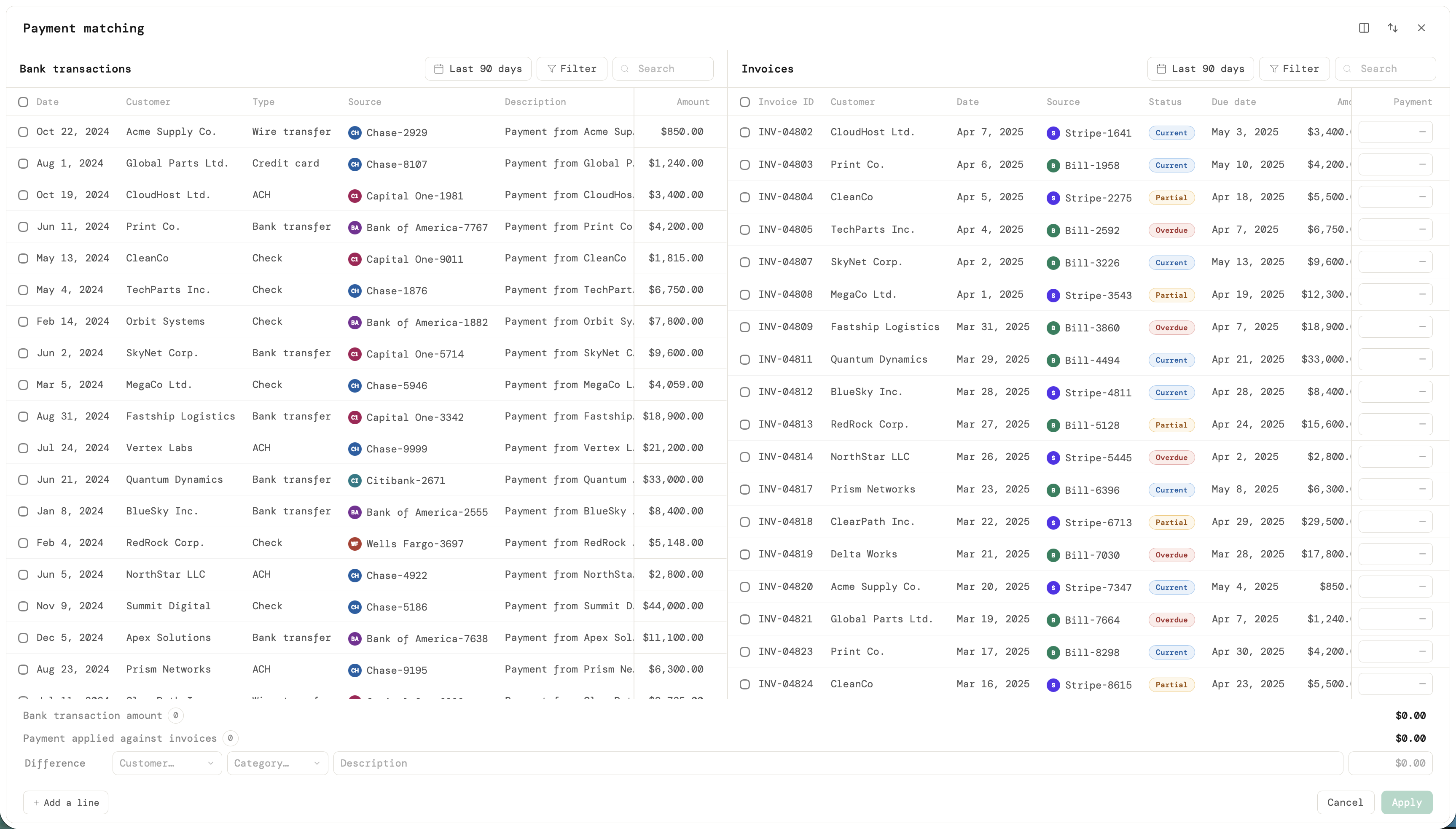
Core model: Both accounts receivable and accounts payable are fully supported. Users can select multiple bank transactions against multiple invoices or bills simultaneously, in any combination.
When a payment doesn't exactly match the invoice amount, users can write out the difference directly from the matching interface, keeping the ledger clean without leaving the workflow.
A payment can be applied to a customer on the receivable side even when the exact invoice isn't known yet. The system holds the unallocated amount and lets the user resolve it later, without blocking the workflow or leaving the ledger in a broken state.
The two-panel UI shows bank transactions on one side and invoices or bills on the other. Panels can be resized to give more room to whichever side needs focus. Orientation toggles between horizontal and vertical to match the user's screen and working style. Panels can also be flipped so transactions or invoices lead, depending on how the user naturally approaches the task.
When a user starts from a bank transaction or invoice that belongs to a specific customer, the opposite panel automatically filters to that customer's records. This dramatically reduces the search space and prevents mismatches, without any manual filter setup.
As a user selects items on one side, the system will proactively protect and suggest matching selections on the other side, reducing conflicts and surfacing the most likely matches. This is the next layer of intelligence on top of the current contextual filtering.
"Whether you start from a transaction, an invoice, a bill, or a customer, the workflow adapts. The UI always works, no matter where you enter."
Outcomes
What the workflow delivered
7dTarget window for payments allocated to invoices
↓Duplicate-payment resolutions & support tickets
↓Reconciliation exceptions from payment matching
Beyond the metrics: making unallocated a real state and reversal a safe action changed the emotional texture of the workflow. Operators stopped treating payment matching as a high-stakes commitment and started treating it as ordinary, recoverable work — which is the whole point. Tracked separately, unapply and reapply actions were expected to rise at first as users corrected old mistakes, then trend down as confidence grew.
Reflection
What I'd tell myself at the start
→
Design the messy states first
The instinct is to nail the one-to-one exact match and bolt on the exceptions later. The exceptions are the product. Partial, multi-invoice, unallocated, and mismatch cases are the daily reality; designing them first would have saved a full redesign pass.
→
Name the concepts precisely and never blur them
Matching, linking, and the payment record look interchangeable until they cause double counting. Holding the line on distinct names — in the UI and the data model — prevented a whole class of silent ledger errors.
→
Reversibility is a design feature, not an engineering detail
The ability to undo isn't a nice-to-have buried in the backend — it's the thing that makes users willing to act at all. Treating unapply as a first-class, clearly-explained action did more for adoption than any amount of automation.