Jigsaw Design System
A systematic design, built to scale
- Role
- Product Designer
- Year
- 2025
- Tools
- Figma, Claude, Storybook
Overview
As Puzzle grew, so did the complexity of the product. New features introduced new components, patterns, and behaviors, and there was no shared foundation holding them together.
The challenge wasn’t simply creating more UI. It was creating a system that could help the entire product stay coherent as it evolved.
I led the effort to build a scalable design system that connected design, engineering, and product around a shared set of rules. Internally, we called it Jigsaw 2.0, a rebuild of an earlier system that had reached its limits.
The problem
Designers could create consistent experiences in Figma, but translating those designs into production wasn’t always consistent. Components could be interpreted differently, patterns could be recreated slightly differently by different teams, and small implementation differences accumulated until similar screens no longer looked or behaved alike.
This created friction for both designers and engineers, and made the product harder to scale.
We needed more than a component library. We needed a system.
Reframing the design system
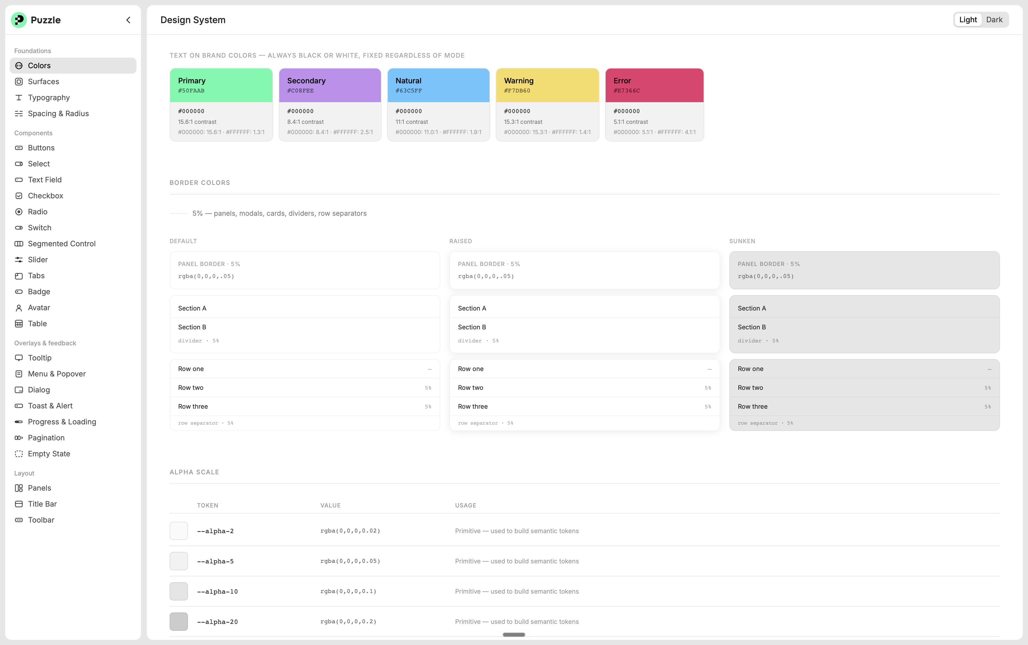
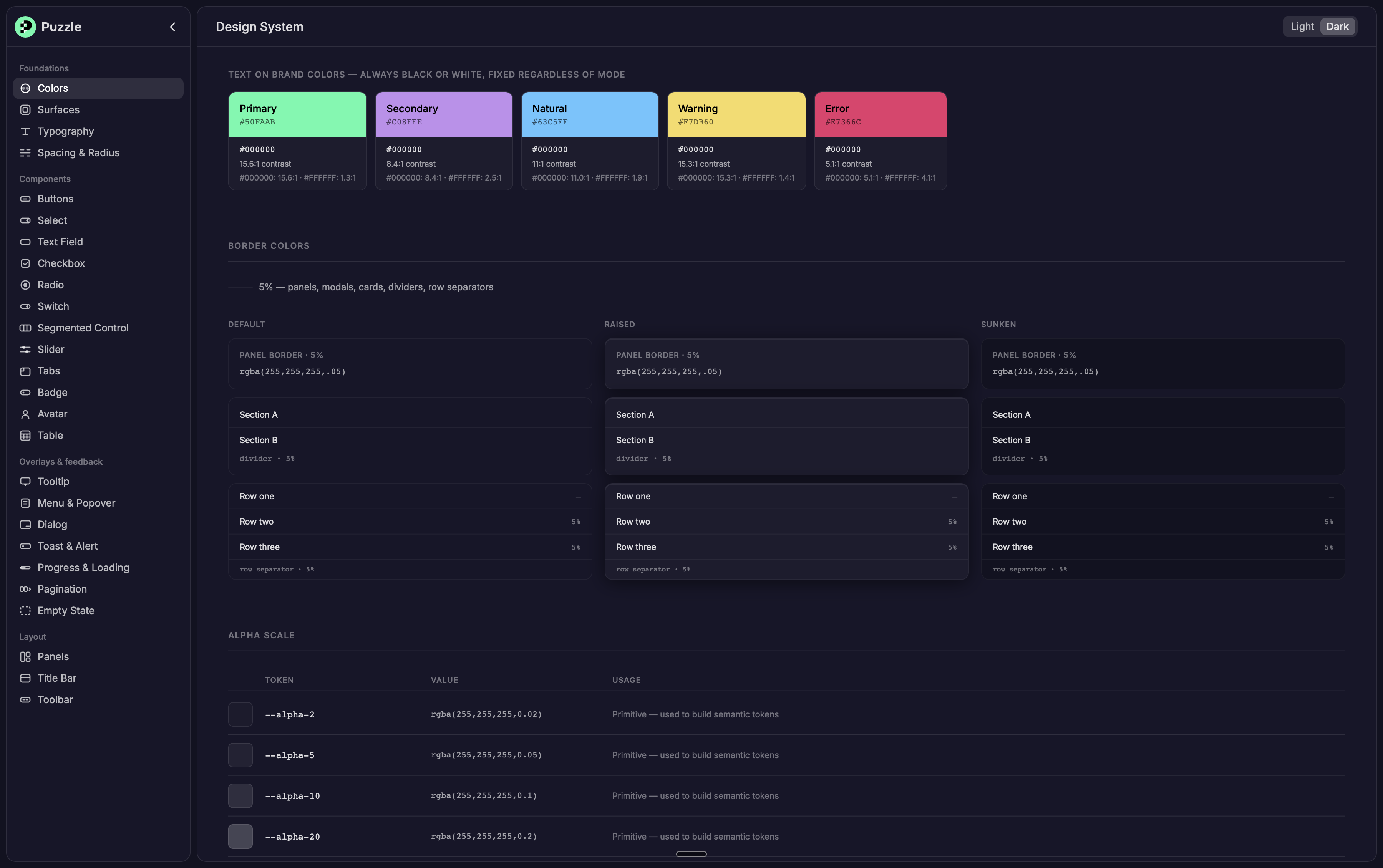
I approached the design system as infrastructure rather than a collection of UI components. Every token, component, and pattern needed to answer three questions:
- Look: typography, spacing, color, and the other visual foundations
- Behavior: interaction patterns, states, rules, and edge cases
- Build: implementation guidance and a clearer connection between design and code
The material itself builds up in layers, each one made from the one before it:
Tokens → Components → Patterns
Designing for composition
A major goal was making the system modular. Instead of designing every new experience from scratch, designers could compose existing building blocks into new experiences.
New product experiences should come from the system, not create another system.
This made consistency a property of the architecture rather than something designers had to manually maintain screen by screen.
Closing the design-to-code gap
The traditional handoff model creates a gap: a Figma file gets handed off, interpreted, and then implemented in code, with room for drift at every step in between. I wanted to eliminate as much of that gap as possible.
The fix wasn’t a better handoff. It was removing the handoff itself. Instead of design specifying an intent and engineering interpreting it, both sides worked from the same definition of a component, close enough to its real implementation that there was nothing left to reinterpret.
Figma file → Handoff → Interpretation → Code
becomes
Design system → Component → Code
This changes the role of design. Design isn’t simply specifying what engineering should build. Design becomes a direct steward of the system that gets built.
The result is greater design-to-code consistency, faster iteration, and less ambiguity between the intended experience and the production product.
A document-first architecture
That same discipline, one shared definition instead of two interpretations, raised a bigger question: not just how a component should be built, but how an entire page should be structured.
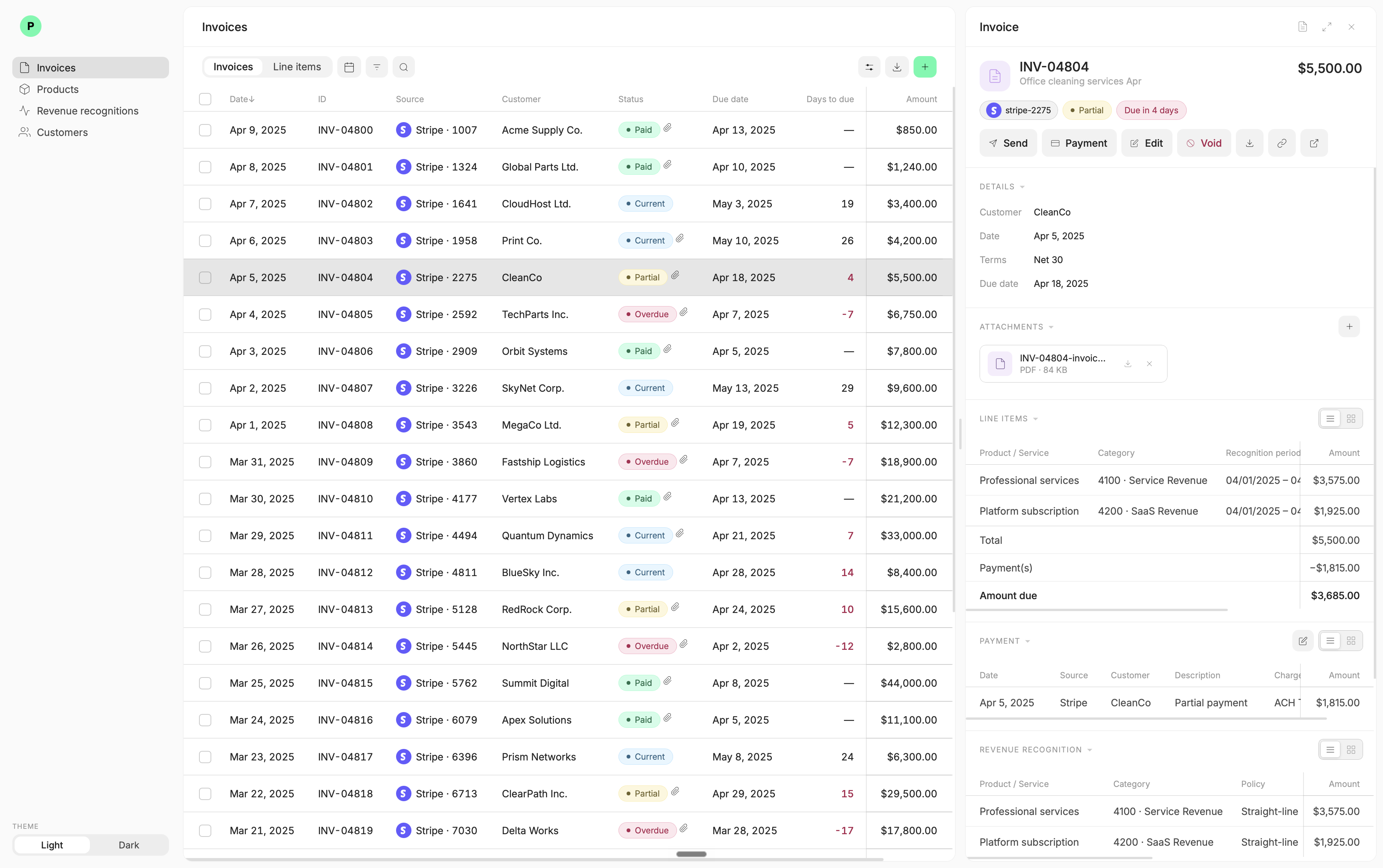
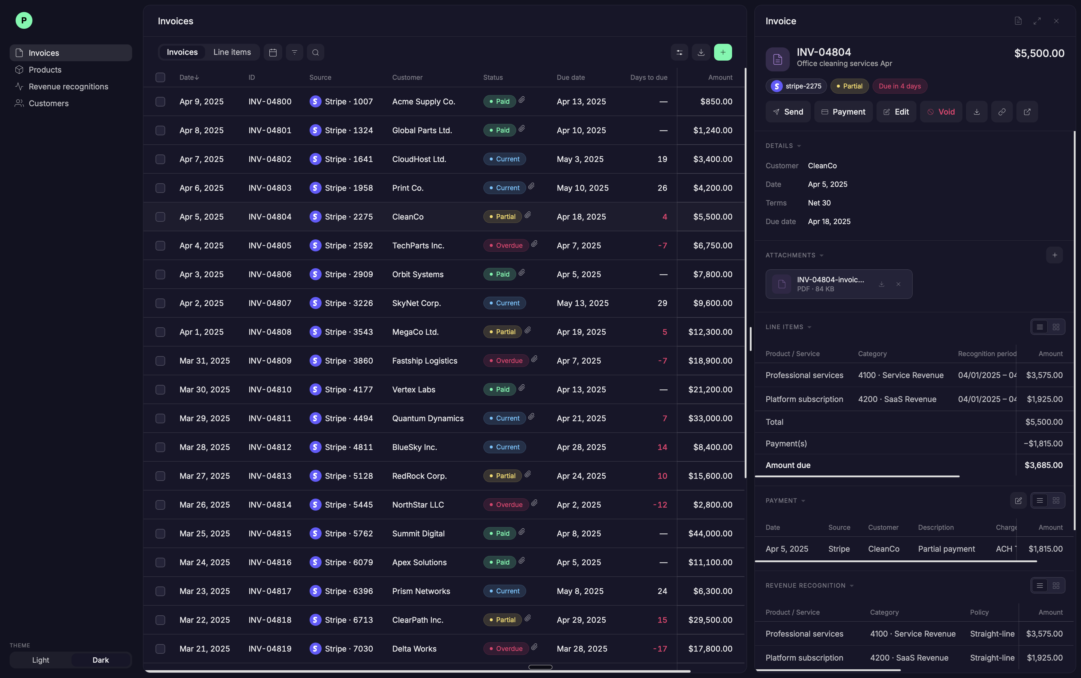
Rather than treating every feature as a different type of page, we established a document-first architecture: the primary view of an object should consistently feel like a document. A transaction, invoice, bill, customer, vendor, account, or revenue recognition schedule could each have their own content and behaviors, but they follow the same underlying structure.
It’s a bit like a standardized shipping container: what’s inside can be completely different from one to the next, but the container itself, its shape, its interface, never changes. That’s what let the system scale to new object types without every new feature reinventing its own layout.
One predictable structure
At the top is a persistent header that immediately establishes what you’re looking at and what you can do with it.
- Type: clearly identifies the object, like a transaction, invoice, bill, customer, vendor, or account
- Identity: the primary identifier or name, often paired with an icon and a short description
- Status and context: compact tags, pills, progress indicators, or other at-a-glance information that communicates the current state
- Actions: the actions relevant to that object, consolidated into the header as a consistent place to find and perform them
The header remains available as the user moves through the document, while the content below becomes the workspace.
Modular document sections
Below the header, information is organized into sections. Each section owns one category of information and follows the same structure no matter which object it belongs to.
That modularity is what lets the system scale. Some sections, like Details or Activity, are shared across almost every object type, so building one well means every document benefits from it. Other sections, like payment information on an invoice/bill, are specific to a single object, and adding one doesn’t require touching the rest of the page.
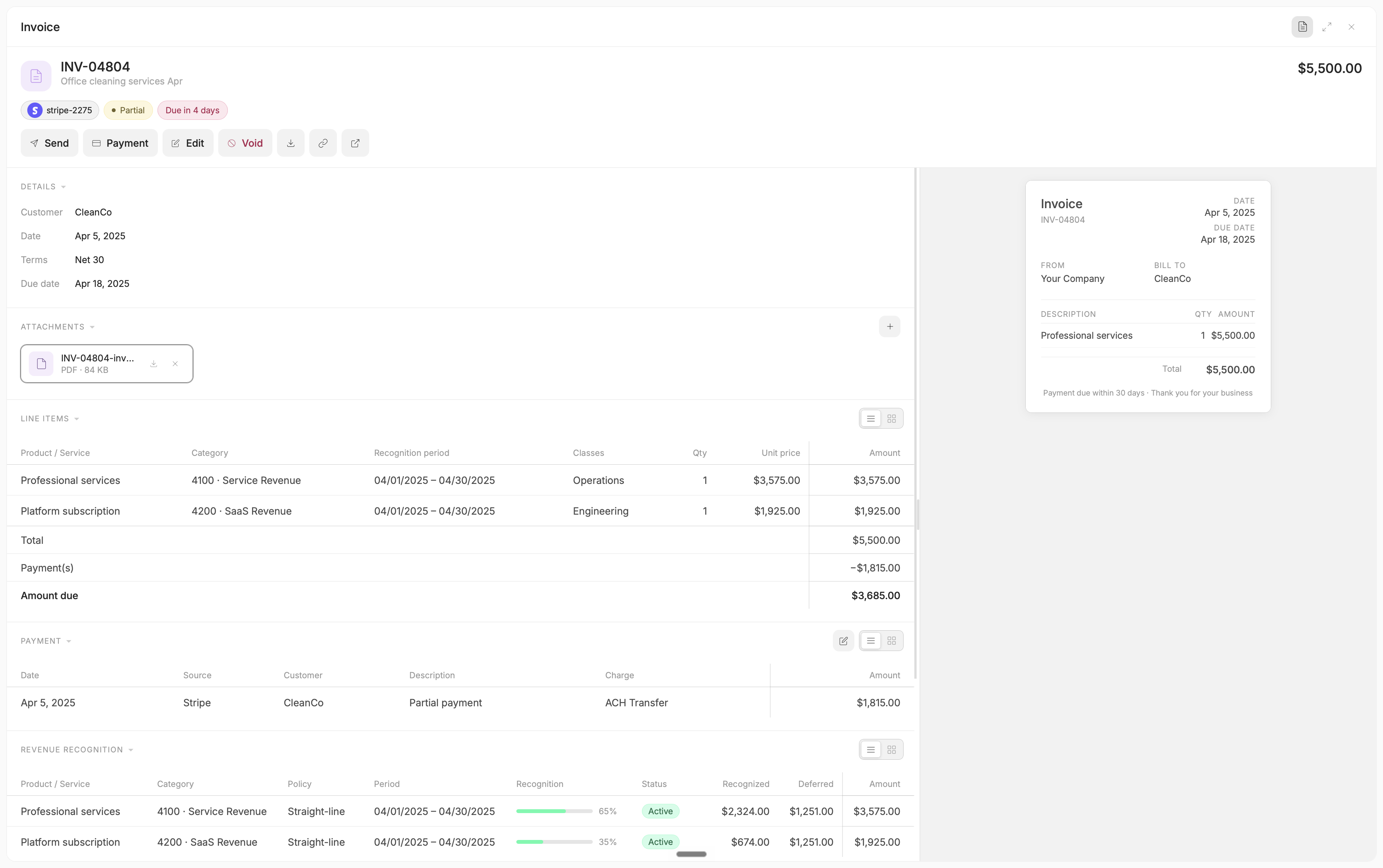
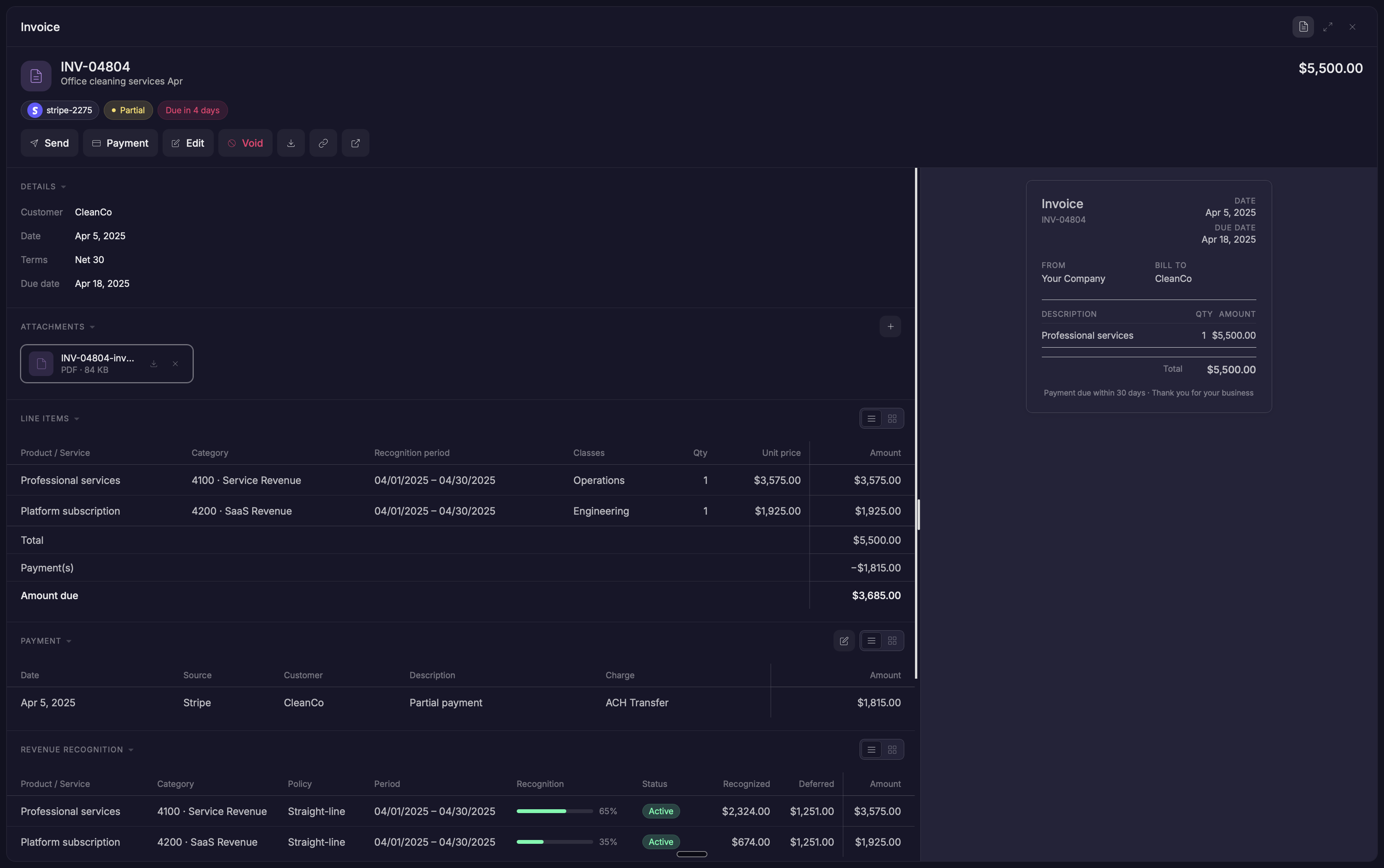
This creates a system where each document can be different without feeling unfamiliar. Different objects. Same mental model.
Building for humans and AI
That same consistency, the thing that let someone learn the system once and reuse that knowledge everywhere, turned out to matter for a different kind of user too. As AI became increasingly involved in product development, the design system became an important source of structured product knowledge.
Rather than giving AI isolated screenshots or individual components, the system could provide the rules behind them:
- What components exist
- How they compose
- When they should be used
- What states they support
- How they behave
- How they should be implemented
This made the system useful not only to designers and engineers, but also to emerging AI-assisted workflows.
Key design decisions
- Treat the system as infrastructure, not a component library: it answers what things look like, how they behave, and how they get built, not just how they’re styled
- Make composition the default: new experiences are assembled from existing pieces, not built as one-off screens
- Remove the handoff, don’t improve it: design and engineering work from the same definition of a component instead of a spec and its interpretation
- Standardize the structure, not the outcome: every object can look and behave differently, but the underlying shape, headers, sections, tokens, stays the same
- Design for more than one audience: the same structured rules that help a designer or engineer also make the system legible to AI
The result
The result was a design system built to scale with the product, not simply document what already existed.
It created a shared language across design and engineering, reduced unnecessary variation, and made it easier to introduce new experiences without reinventing established patterns.
Consistency wasn’t limited to documents. The same principles governed the product’s other core pattern, tables: filtering, sorting, grouping, and column pinning became just as foundational as the document structure itself.
More importantly, it shifted the role of the design system from a library of UI to an operating system for product design: a common foundation for how Puzzle looks, behaves, gets built, and evolves.
What I took away
A design system succeeds when people stop thinking about it. Not when the token list is complete or every component exists, but when using the right pattern is easier than inventing a new one.
That was the real test for this system: not whether it looked polished, but whether the product held together as more people built more of it, without anyone having to think about why.
Design once. Compose everywhere. Build with confidence.